Maximalist Interior Design: How to Add Pattern, Colour and Character Without the Chaos
- Maximalist Interior Design: How to Add Pattern, Colour and Character Without the Chaos
- Maximalism is not "more" — it is "more, for a reason"
- Minimal maximalism: how to start when it feels risky
- Colour: three shades that hold a room together
- Prints and patterns: the scale rule
- Which piece to start with
- Fabric you want to touch
- Light that brings the pattern out
- Where maximalism turns into eclecticism
- Building the scene: who competes with whom
- Five mistakes that make maximalism look like mess
- Frequently asked questions
Maximalist Interior Design: How to Add Pattern, Colour and Character Without the Chaos
There is a moment when a neutral room stops working. Pale walls, a beige sofa, a rug that matches, everything in its place — and nothing holds your eye. You walk through and never stop. You don't want a renovation, but you don't want to keep living like this either.
Maximalist interior design came back because of exactly that feeling. Not as a style for large houses with cornicing and a porcelain collection, but as permission to put one loud thing into an ordinary flat. We see it every day at MAIIMO: someone spends months choosing a neutral sofa, then falls for a printed pouf in ten minutes — and that is the piece that changes the room.
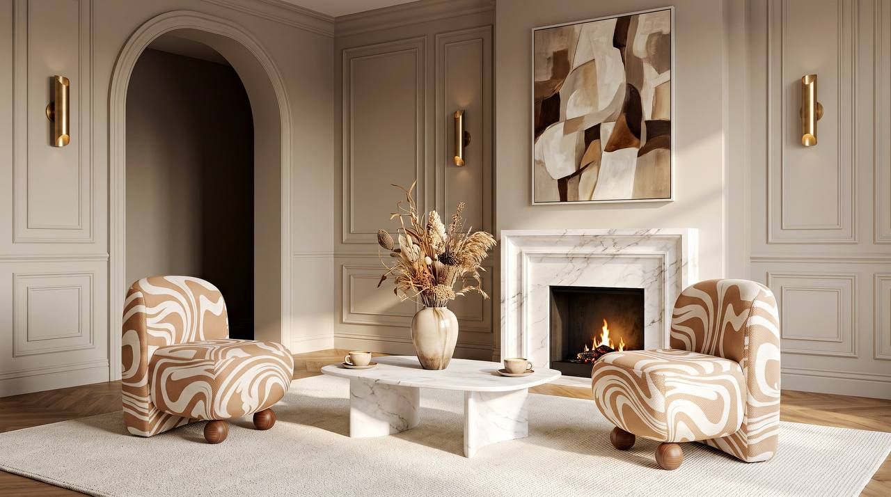
Maximalism is not "more" — it is "more, for a reason"
The most common mistake is confusing maximalism with clutter. The difference is simple and unforgiving: in a maximalist room every object was chosen, in a cluttered one it simply stayed. The first takes editing. The second is the absence of it.
Which makes maximalism harder than minimalism, not easier. Minimalism forgives indecision — remove everything extra and you are already fine. Maximalism forgives nothing. Six bold objects in a room with no clear lead is not courage, it is noise.
Hence the first rule we start every conversation about a bold interior with: one hero per room. One thing allowed to shout. Everything else supports it. With two heroes they argue, and the wall wins.
Minimal maximalism: how to start when it feels risky
Minimal maximalism is not a compromise for the timid — it is the smartest way in. You keep a neutral base (light walls, a quiet floor, a restrained sofa) and add one or two pieces with character. The base works as silence, and against silence a voice carries.
In practice: 80% calm, 20% loud. Twenty per cent is not much. It is an armchair. Or a pouf and a cushion. Or a floor lamp you can see from the hallway. But those twenty per cent are what people remember and photograph.
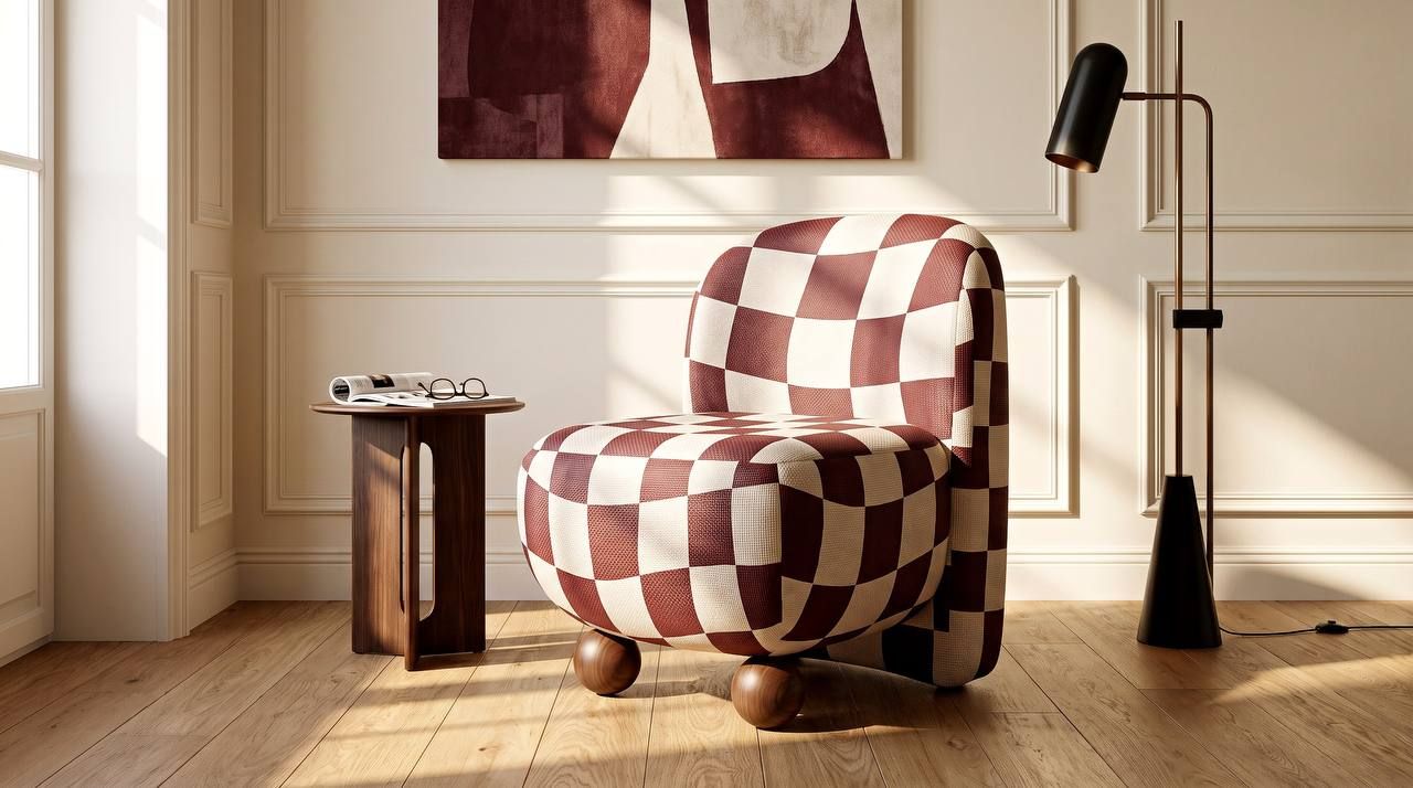
Colour: three shades that hold a room together
When a room holds a lot, colour stops being decoration and becomes structure. It does what nothing else does: it ties together objects that have nothing in common.
The working scheme is three to five colours, each repeated at least twice in the room. One lead, one supporting, one sharp. The wine tone in a cushion should answer in a lampshade. The warm orange on a pouf should answer in book spines or a frame. That is enough for the eye to read the room as intent rather than storage.
This is where colour accents mean what they are supposed to mean. An accent is not just a bright patch. It is a patch with a partner. One red cushion on a grey sofa reads as a mistake. Two red things in opposite corners read as a decision.
What we notice in practice: people are not afraid of bright colour, they are afraid of lonely bright colour. Give it an echo and the fear goes.
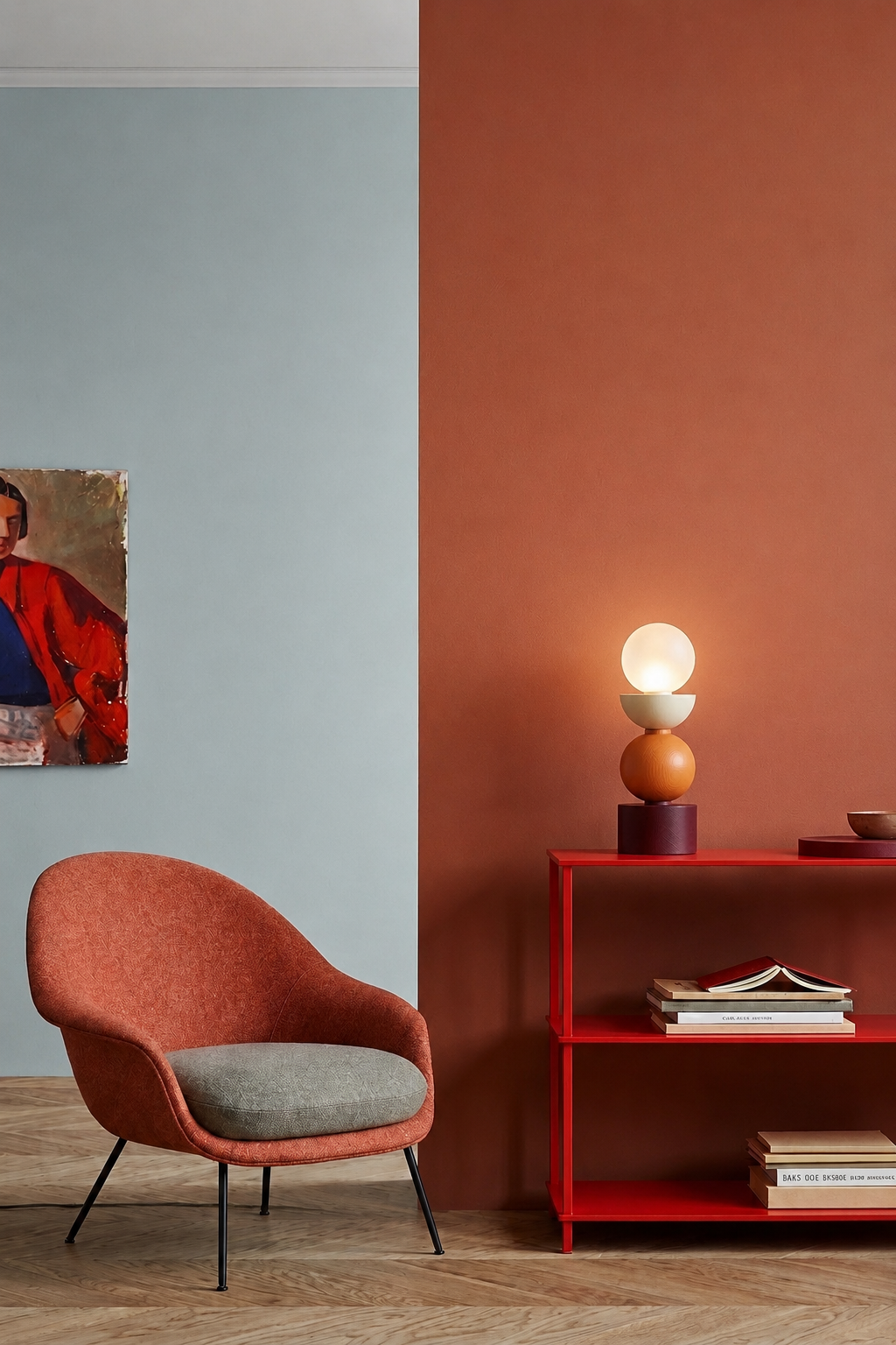
Prints and patterns: the scale rule
Pattern is the main instrument of this style and the thing people most often get wrong. Not because pattern is difficult, but because they take it in the wrong size.
Scale matters more than subject. A large graphic pattern on a small object looks cropped — the drawing never gets to unfold. A small repeat across a large surface turns into texture and loses its point. The rule that saves you: the smaller the piece, the larger and simpler the pattern on it should be.
When it comes to mixing patterns, one thing works: different scale, shared palette. Two patterns of the same size fight for attention. Two patterns of different sizes in one palette read as layer and underlayer. Three is the ceiling for an ordinary room; beyond that you need instinct, not a rule.
One more thing almost nobody writes about: an artistic print and a decorative repeat are different genres. A repeat calms. An artistic print has composition — a top and a bottom, a centre and a field. It behaves like a painting that happens to lie on an object instead of hanging on a wall. Which is why a piece like that should not sit directly beneath a large artwork — they cancel each other out.
Which piece to start with
Here is the practical part. Maximalism does not require a renovation — it requires one right decision. Three scenarios, from most cautious to boldest.
The most cautious step is a small piece you can move. Poufs are unbeatable here: 40–45 cm across, light enough for a child to carry, at home anywhere. If it doesn't work in the living room, it moves to the bedroom. The round Ritmo Art, for instance, is 45 cm tall and 40 across — smaller than photos suggest. It is a risk you can undo in ten seconds, which is precisely why it makes a good beginning. A bonus: on a pouf the pattern is visible whole, from every side, like a sculpture.
The bolder step is a piece that builds a zone around itself. Armchairs work differently: they do not get added to a room, they rearrange it. Put a printed armchair in a corner and the corner stops being empty space and becomes somewhere to read. Seat height matters here: at 45 cm you sit rather than sink, so the zone actually gets used instead of staying decorative.
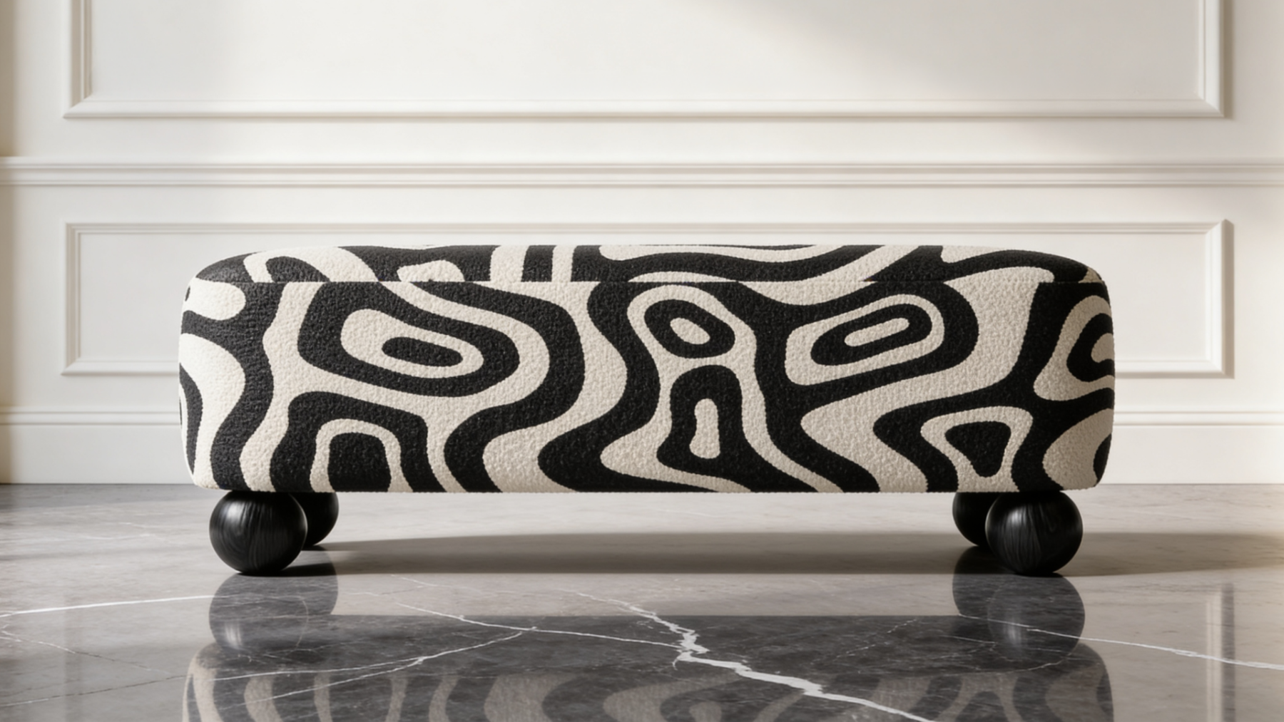
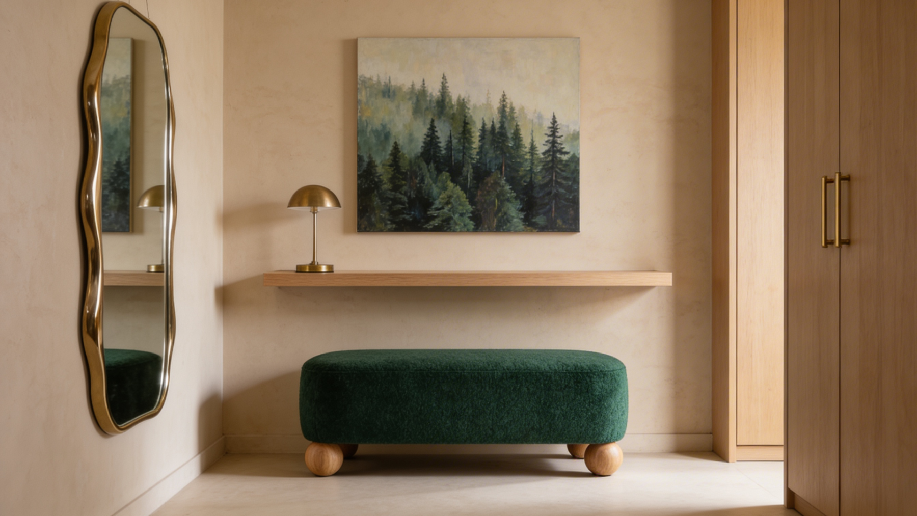
The most unexpected step is a piece where nobody expects it. Upholstered benches are usually bought for the entryway, for function — somewhere to sit and put shoes on. But a bench with an artistic print at the foot of a bed, or under a living-room window, behaves entirely differently: the elongated form gives the drawing room to breathe, and the piece reads like a gallery bench. At 80, 100 or 120 cm, each length divides a wall its own way.
Fabric you want to touch
The same print on velour, bouclé and chenille is three different objects. Velour absorbs light and deepens colour, almost theatrically. Bouclé breaks the drawing up with texture, so the graphic softens. Chenille sits in between: bright colour, calm surface.
This is what photographs never show and what decides everything in person. So choose interior textiles not by the picture but by how the cloth behaves with the light in your room — a north window and a south one give very different results from the same fabric.
And on the fear of tiring of it. That fear is justified exactly in proportion to how permanent the piece is. A wall painted emerald is a five-year decision. A pouf lasts as long as you want it to. Mobility is the insurance that makes a bold choice safe.
Light that brings the pattern out
Overhead light kills a drawing. A single ceiling fitting floods everything evenly, shadows disappear, and with them the texture and depth of the print. A maximalist room lit by one pendant looks worse than the same room with no pattern at all.
Layered light is not optional here. Two or three sources at different heights: a dimmed overhead, a floor lamp to one side, a table lamp low down. The drawing starts to live; volume and movement appear.
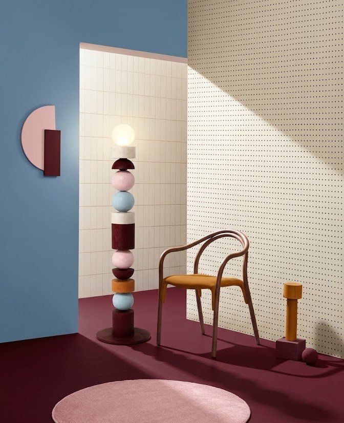
The light itself can be the hero, incidentally. The Namysto collection by designer Alisa Lysykh is built from spheres, cylinders and half-domes after Ukrainian coral necklaces, and its 120 cm floor lamp behaves more like a sculpture than a fitting. If the room already has a printed piece, take a lamp like this in a quiet tone. If it doesn't, floor lamps can happily carry the accent themselves.
Where maximalism turns into eclecticism
The two words get used interchangeably, though they describe different things. Maximalism is about density: how much is in the room. An eclectic interior is about origin: where it all came from. You can build an eclectic room from three pieces of different eras and stay restrained. You can build a maximalist room in a single palette and a single style.
The interesting part is the overlap. A retro armchair silhouette on spherical feet plus contemporary graphics on the upholstery. A round wooden table quoting a folk ornament, next to a geometric print. Collisions like these look deliberate because there is a conversation between the pieces, not just proximity.
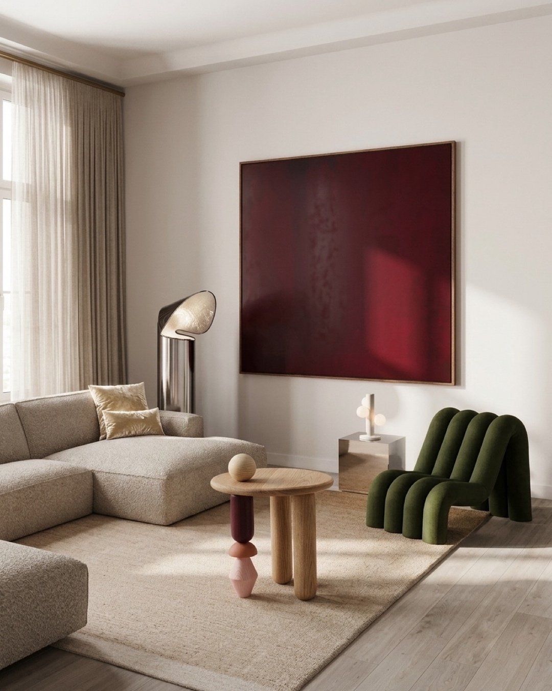
Wood is the best neutraliser in a room like this. Not white — natural timber specifically: it gives the eye a rest without cooling the room down.
Building the scene: who competes with whom
Once the room has its hero, the remaining surfaces have to decide whether they are participants or background. The conflict is usually between four: rug, cushions, curtains and wall. All large, all visible, and any of them can pull focus.
A simple order of operations helps. The rug is the foundation, and it usually carries the largest pattern; it is easier to work outwards from it than back towards it. Curtains are the quietest participant, because they cover the most surface — plain almost always wins there. Cushions are where the second, smaller pattern belongs. The wall stays empty, or nearly, if the hero stands in front of it.
One observation from practice: a large artwork above a printed armchair almost never works. Two compositional centres on one vertical, and the eye doesn't know where to go. Either the artwork or the print. They live together when they are on different walls.
Five mistakes that make maximalism look like mess
No shared palette. Every piece is good on its own, but the colours never repeat. The room reads as a set of coincidences. This is the cheapest fault to fix: add a second object in a colour that is already there.
Every pattern the same scale. Three medium drawings side by side make the eye vibrate. You need a hierarchy: large, medium, small.
One hero and emptiness around it. A bold armchair in a sterile room looks lonely rather than brave. It needs at least one companion: a cushion, a book, a lamp in the same colour.
A single light source. The most common mistake and the most expensive in its consequences. One ceiling pendant flattens everything you spent so long choosing.
Buying the room as a set. A maximalist room is assembled over months and looks like a biography. A room bought in one evening looks like a shop window — even when everything in it is right.
Frequently asked questions
Does maximalism work in a small flat?
Yes, but the arithmetic changes. The smaller the floor area, the fewer pattern carriers and the greater each one's contribution. In a 12 m² room, one printed piece works better than three — and looks more expensive.
How many patterns can you mix in one room?
Two or three, provided the scales differ and the palette is shared. More is possible, but then you need an anchor: a large plain rug or a quiet wall for it all to sit against.
What is the difference between maximalism and eclecticism?
Maximalism is about quantity and density. Eclecticism is about mixing eras, styles and sources. They often coincide, but they are not the same thing.
Won't a bold print get tiring after a year?
That depends on how movable the piece is. Something you can carry to another room or replace tires you far less often than something nailed to the wall.
Where should I start if I'm nervous?
With the smallest piece in the most visible place. Not with a large piece in a corner — that spends the budget and shows you nothing.
Maximalism asks for no renovation and no flat-wide bravery. Often one object is enough — chosen not because it matches, but because you like it. The rest of the room will adjust. It always does.


